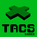
TACSgames hasn’t ever had a logo before (which seems like a strange thing for a games company). I’ve now corrected this oversight. Below are two versions of the TACSgames logo, one in green (like on a gameboy 4 colour screen) and one in colour (which will be used for Super Skull Smash GO!).
These are obviously pixel art versions for the upcoming games of that style. A nice smooth vector version should appear at the top of this website at some point in the very near future.
The logo is supposed to look like an old school gaming directional pad and also a little bit like a scary face with red eyes and a toothy grin. These will appear in the upcoming videos for PROJECT SPACE DARK and Super Skull Smash GO!
I hope you like them (and that they are visually distinct from other games company logos).


